Illustrating multigene mapping data in a spreadsheet format
--Edward Weck
A number of statistical methods are available for distinguishing genetically important regions from random effects in mapping populations. These methods vary in complexity from regression analysis to interval mapping. Plant F2 pedigrees are much simpler than the human pedigrees used for mapping multigenic traits. In a plant F2 population, the entire dataset consists of but three genetic alternatives; the two parental alleles and the heterozygote of the two parents. With plants, it is also possible to grow populations of unlimited size which helps reduce the complexity of multigenic mapping. I thought it would be possible, because of this underlying genetic simplicity, to gain further insight into the genetic underpinnings of a phenotypic trait via a graphical data representation. The entire data set could be "spectrally mapped," with each possible allele represented by a different gray scale value.
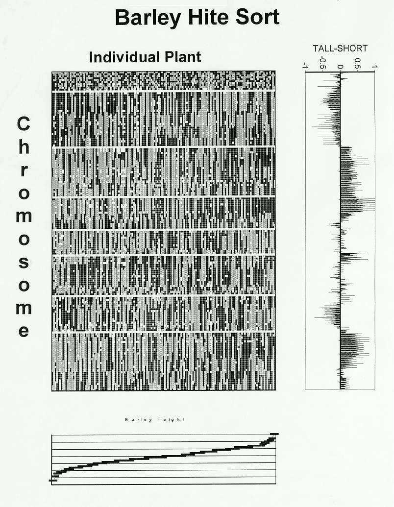
Because of the extremely high economic and scientific value of maize datasets, I was unable to obtain any maize molecular marker data associated with phenotypic traits. To allay this problem, I obtained a barley dataset from the Grain Genes database on the Internet (courtesy of the North American Barley Genome Mapping Project). The molecular marker and phenotypic data were from a doubled haploid cross of Steptoe x Morex (150 plants, 150 probes). A doubled haploid dataset is simpler than an F2 dataset with only the two parental alleles possible. Along with the genetic data, I also downloaded the marker mapping information and phenotypic data for plant height.
An ordered array of genotypic and phenotypic information is displayed in Figure 1. The Steptoe allele is encoded by a gray square, the Morex allele by a black square and missing data by a white square. The individual lines are sorted by increasing plant height (shown at the bottom) along the x-axis and by chromosome number (and probe position) from top to bottom along the y axis. Unmapped probes are shown at the top, followed by probes on the seven barley chromosomes separated from one another by white lines in the graphic.
The unmapped probes at the top of the figure exhibit a random pattern, as they are not organized with regard to either genotype or phenotype. In contrast, one parental allele predominates on certain chromosomal segments when comparing the tallest and shortest plants. A preponderance of the Morex allele on chromosome three, and possibly seven, and the Steptoe allele on chromosome one seemed apparent from looking at this graphic.
After pondering the graphic for some time, I decided some sort of summary statistics would be needed to assure completeness in interpretation. The most intuitive way to analyze the data, I thought, was to compare multiple slices of the data. The tall- short summary on the right of the figure compares the averages of: the (tallest five - shortest five) genotypes, the (tallest ten - shortest ten) genotypes, ..., the (tallest half-shortest half) of the population. The same result was observed for the (tallest five - shortest five) as with the (tallest half of the population -shortest half of the population) with the exception of the long arm of chromosome one. Here the genetic effect was exaggerated in the (tallest five - shortest five) because of missing data. An effect more consistent with the remainder of the population was, however, observed in the (tallest ten - shortest ten).
There is more than one way to be tall. Although a region on chromosome three appears to be necessary for plant height, tall plants do not have an absolute requirement for the other "tall" genes. Breeding for tallness would require the inclusion of the top three or four "tall" genes when these genetic regions didn't conflict with other phenotypes of breeding importance. This lack of absolute necessity for certain "tall" genes would seem to allow a certain flexibility in the creation of improved breeding materials.
When I started this analysis I thought that I should be able to see the genetically responsible regions in a population by merely looking at the raw data. With this graphical data presentation one can readily see the complete genotype of every individual within the population as well as where recombination has taken place in the creation of that individual. It is also easy to envision the effects of pooling individuals for measurements involved in mapping multigenic traits. Improving a population for a single multigenic trait simply requires growing a large population and analyzing the five or ten best and worst phenotypes. In addition, it should be possible to learn more from available inbred databases if the molecular marker data are presented in conjunction with phenotypic data.
I have taken advantage of a number of commercially available programs in creating this graphic, including: Access, Corel Chart, Lotus Improv, and Quattro Pro. (The original inspiration for this graphic came from The Computational Brain, p.114, by Churchland and Sejnowski, 1992.) I am currently working on an application that uses the spreadsheet format to display genetic information and allow rapid switching between various phenotypic sorts.
Return to the MNL 68 On-Line Index
Return to the Maize Newsletter Index
Return to the MaizeGDB Homepage